App Demander Version 5.02 - 09/02/2026
This post shows what changed in the App Demander look in version 5.02.
5.02.3
Section titled “5.02.3”Search and filters within reach when scrolling the list
- In long lists, scroll up a little and the header with search and filters comes back, without returning to the top.
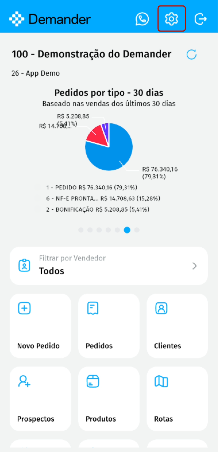
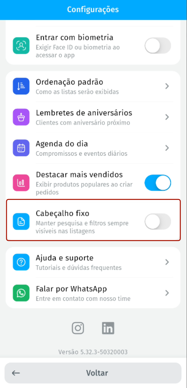
- If you prefer the header always visible, turn on Fixed header in Settings > Usage preferences.
5.02.0
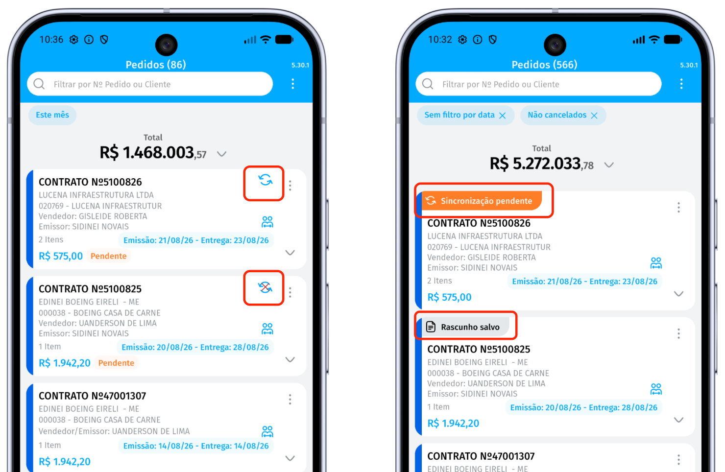
Section titled “5.02.0”Pending sync orders easier to identify
- Before, only a circular icon showed that the order had not been synced yet.
- Now the order shows the Pending sync label.
- Orders still in draft show the Saved draft label.
In the image below, the previous layout is on the left and the new layout is on the right.
Filters in view, with direct access
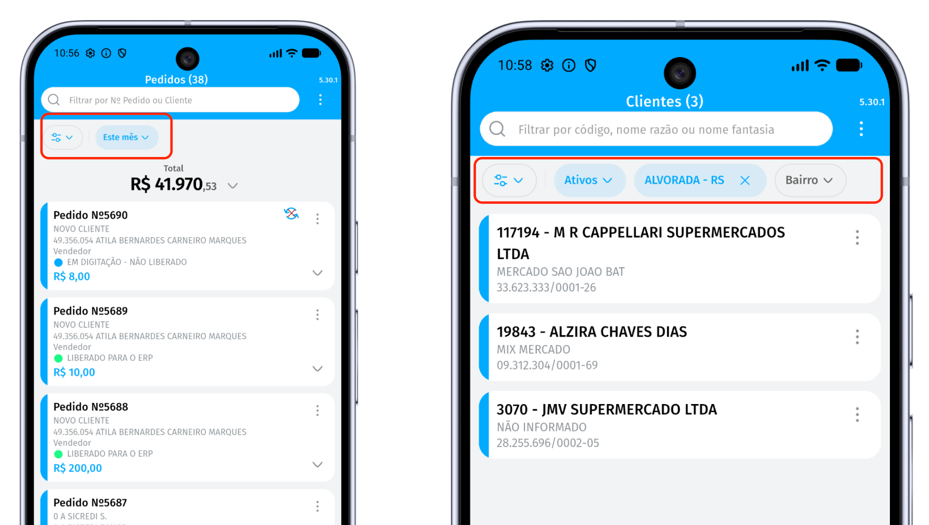
- Before, the screen showed only the date filter and the filters already applied.
- Now, every available filter appears right below the search.
- When you tap a filter, the app opens that filter’s selection directly.
- When you choose a new filter of the same type, it replaces the previous one.
In the image below, the previous layout is on the left and the new layout is on the right.
New look for the product row and the order item
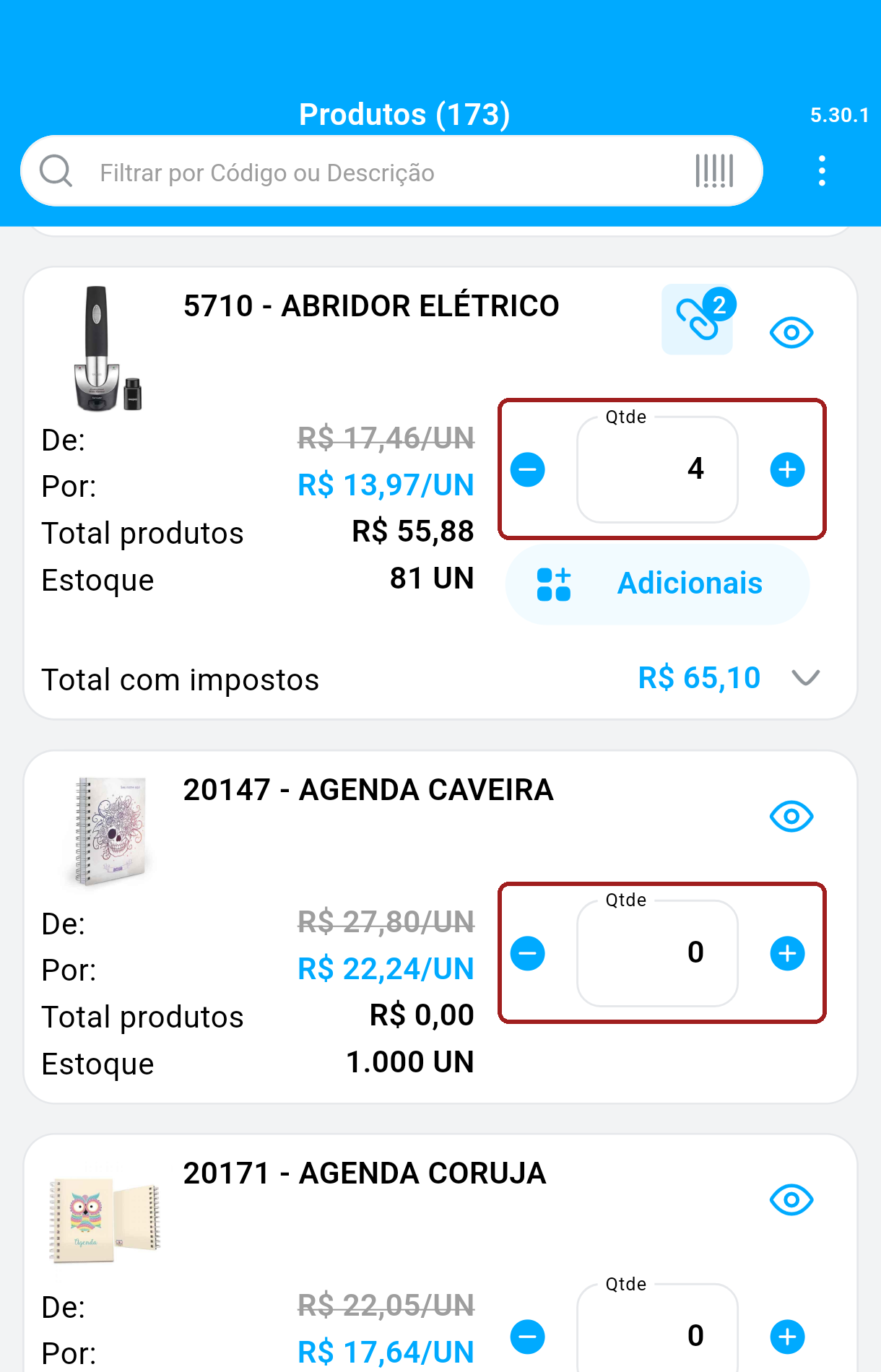
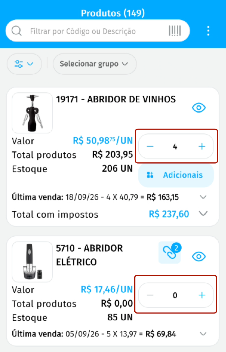
- Product rows, in product lookup and when adding items to the order, have a new layout that is more organized and easier to read.
- The quantity field changed: it now sits next to the price, with the − and + buttons to adjust it right on the product row.
Customer list: choose the name that appears first
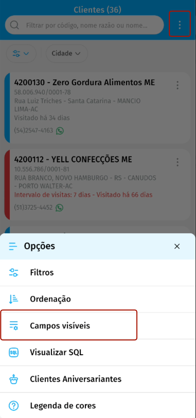
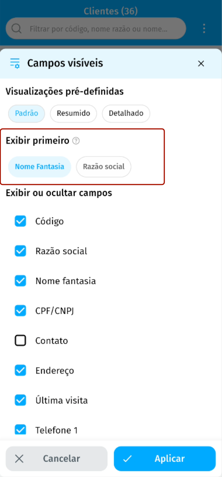
- In Visible fields, the Show first option lets you highlight the Legal name or the Trade name in the customer title.
- The icons and buttons on the customer row now sit under More options.
Barcode scanning in product lookup
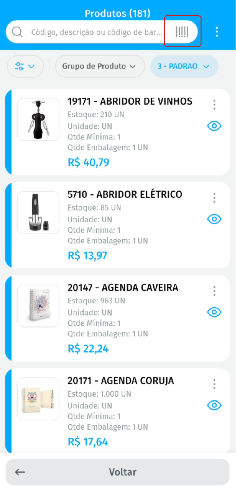
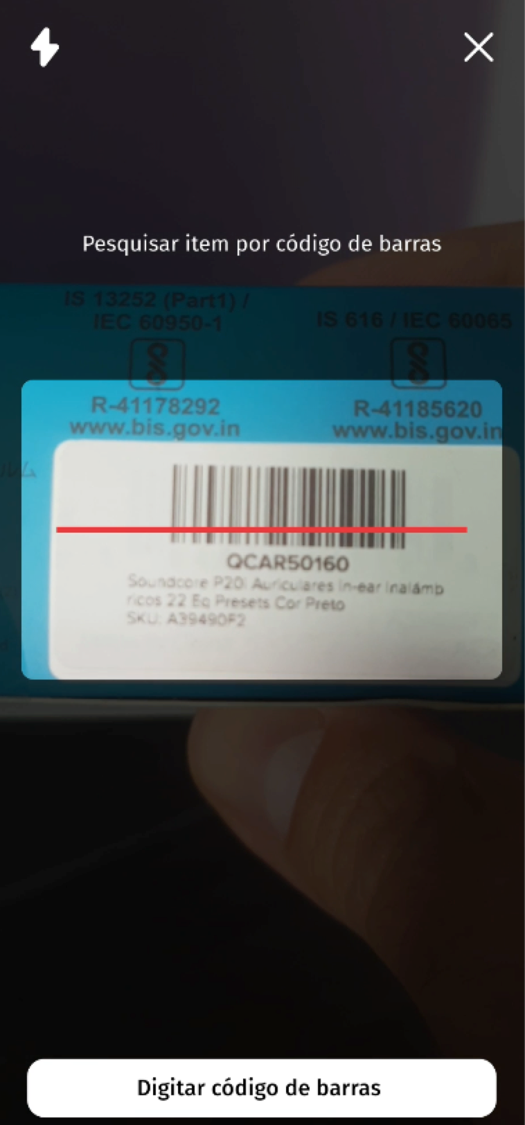
- The search field in the product list and when adding items to the order shows the barcode scanning button.
- The button appears when the search is empty, on Android and on iOS.